


A good font pair makes a layout look cleaner. It also makes text easier to read.
Everything fonts in this list is free.
One family
Use different weights from the same type family. This is the safest option.
Inter: Extra Bold + Regular

Source Sans Pro: Black + Regular

Geist: Extra Bold + Regular

EB Garamond: SemiBold + Regular

One superfamily
Pick serif and sans serif fonts from the same superfamily. They feel related, but you still get a clear difference.
IBM Plex Sans Bold + IBM Plex Serif Regular

Roboto Flex Bold + Roboto Mono Regular

Instrument Serif + Instrument Sans Regular

Red Hat Display Extra Bold + Red Hat Mono Regular

Complementary
Pair a sans serif with a serif. They are different, but they balance each other.
Playfair Display Bold + Varta Regular

Fraunces Bold + Inter Regular

Space Grotesk Bold + Libre Caslon Text Regular

Spline Sans Mono Bold + Neuton Regular

Contrast
Let the heading font do the “loud” part. Keep the body font calm and easy to read.
Anton + Martian Mono Regular

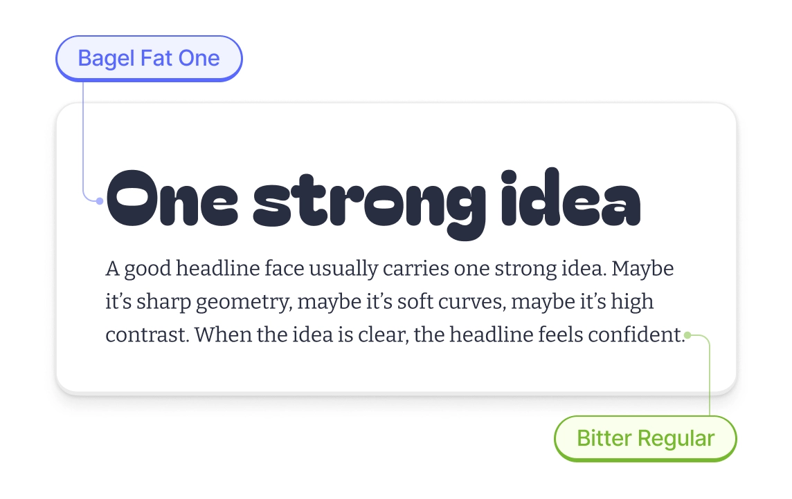
Bagel Fat One + Bitter Regular
Unbounded Bold + Spline Sans Regular

Montagu Slab Bold + Inter Regular

A 2-minute check
- Use a real paragraph (30–90 words) and a real headline (2–6 words).
- Set sizes: body 16–18px, headline 40–56px.
- Check details: numbers, quotes, hyphens/dashes, colons, parentheses.
- If the headline is too loud, make it calmer: use a lighter weight or a smaller size.
- Stop at two fonts. Less choice means a cleaner system.
More typography resources
Want to dive deeper into typography? Check out our guide to using Garamond in modern designs. If you’re building logos, our typography logo examples showcase 50+ brands that nail their font choices.
For broader design guidance, explore our collection of free graphic design software that includes built-in typography tools. And if you’re working with existing designs, learn how to kern fonts properly to make any typeface look more professional.
About the author
Maya Chen. Typography designer focused on creating readable, functional type systems for digital products. Believes good design starts with choosing the right fonts and making them work together harmoniously.


