The Ultimate 2026 Dribbble Select Best Shots of the Year

Dribbble Select curates the most notable design work on the platform, highlighting projects that combine strong visual execution with clear thinking behind the interface, brand, or product. The selection goes beyond aesthetics, focusing on work that communicates ideas effectively and reflects current industry standards.
The list below brings together the standout shots of 2026, showcasing how leading design agencies approach complexity, usability, and storytelling across different categories.
Table of Contents
Noteworthy Shots
These shots demonstrate strong execution, whether through structure, usability, or visual storytelling, while maintaining a clear connection between design decisions and real-world outcomes.
1. BioForge Website — Precision Design for High-Stakes Biotech
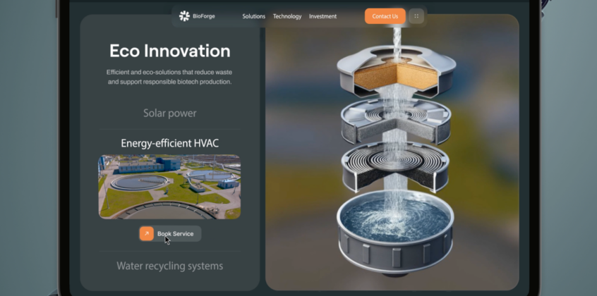
- Agency: Phenomenon Studio
- Client: BioForge
- Industry: Manufacturing
Phenomenon Studio created a website that mirrors the precision and discipline of biotech manufacturing. Structured layouts, sharp typography, and a restrained color palette convey compliance, safety, and technical authority.
Large-scale visuals showcase automation and cleanroom environments without adding clutter, while subtle microinteractions keep navigation clear and controlled. Content follows real operational logic, helping users grasp complex systems quickly. The result presents BioForge as both highly advanced and dependable, reinforcing trust through a clean, methodical digital experience.
2. Shift Robotics – Industrial Tech Brand System
- Agency: IDOL
- Client: Shift Robotics
- Industry: Technology
IDOL’s work for Shift Robotics stands out by creating a brand that feels engineered rather than visually embellished. The identity is built on a restrained color palette, bold typography, and structured layouts that communicate precision and control.
Subtle visual details and minimal graphic elements suggest motion and innovation without introducing unnecessary complexity. The system is applied consistently across the site, resulting in a clear and confident presence that reflects the technical nature of robotics while still maintaining a modern and approachable feel.
Top 5 Branding Shots
The following branding shots highlight how strong identity systems go beyond visuals to create clarity, recognition, and consistency across touchpoints. Each project demonstrates how color, typography, and structure work together to communicate positioning and build trust at scale.
For a deeper breakdown and the full list of standout work, explore our Branding Best Shots of the Year.
1. FleetGuru Platform — Operational Data Turned Into Actionable Insight
S25’s FleetGuru interface stands out by introducing structure and clarity to complex fleet operations. The design applies a strong visual hierarchy and clear data grouping, making vehicle performance, maintenance, and usage insights easy to scan and act on.
Bold accent colors draw attention to critical actions without overpowering the interface, while clean layouts keep dense information well organized. The result enables faster decision-making for operators, transforming fragmented fleet data into a cohesive, actionable system.
2. Freeport Markets – Institutional DeFi Brand Identity
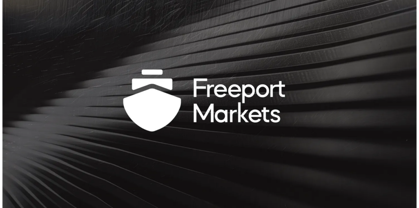
- Agency: Eloqwnt
- Client: Freeport Markets
- Industry: Fintech
Eloqwnt’s work stands out by introducing structure and credibility into a space often dominated by noise and complexity. The identity is built on a restrained palette, confident typography, and precise language that communicate discipline and trust.
Rather than relying on typical crypto aesthetics, the brand aligns itself more closely with institutional finance, clear, controlled, and performance-oriented. The result is a system that makes decentralized finance feel more accessible and credible, meeting the expectations of serious investors rather than casual users.
3. Lamar – Scalable Out-of-Home Brand System
- Agency: Unfold
- Client: Lamar Advertising
- Industry: Advertising / Media
Unfold’s rebrand stands out by creating a system built to scale without sacrificing clarity. The identity sharpens Lamar’s heritage through a strong green palette, highly legible typography, and simplified forms that remain effective across billboards and digital screens.
Each element is designed for visibility and recognition at a distance, maintaining consistency across thousands of placements. The result is a modernized brand that stays grounded in its legacy while operating as a flexible, high-performance system in real-world conditions.
4. Bravix – B2B Ecommerce Brand Interface System
- Agency: Dipa Inhouse
- Client: Agency Commissioned
- Industry: eCommerce
Dipa Inhouse’s concept stands out by transforming a complex B2B ecommerce workflow into a clear, structured brand experience. The design applies a calm, neutral palette and consistent spacing to reduce visual noise, guiding users through product data, inventory, and sales insights with minimal friction.
A strong hierarchy and predictable layouts make the system easy to navigate, even when handling dense information. The result is a practical, product-led identity that demonstrates how clarity and organization can shape a brand as much as visual style.
5. Another AI Thing – Expressive AI Logo Motion System
- Agency: Lepisov Branding
- Client: Agency Commissioned
- Industry: AI
Lepisov Branding’s work stands out by treating the logo as a dynamic system rather than a fixed mark. The animation incorporates distortion, fluid motion, and layered transitions to capture the evolving and unpredictable nature of AI.
Bold color contrasts and shifting forms create a sense of energy while maintaining recognizability. The result is a flexible logo system that adapts across digital environments, demonstrating how motion can function as a core part of brand expression rather than a secondary detail.
Top 5 Web Design Shots
The following web design shots highlight how leading teams turn complex ideas into clear, conversion-driven experiences. Each project demonstrates strong structure, focused messaging, and deliberate interaction design that supports both usability and business goals.
For a deeper breakdown and the full selection of standout projects, explore our Web Design Best Shots of the Year.
1. CargoKite Homepage — Interactive 3D Storytelling for Ocean Innovation
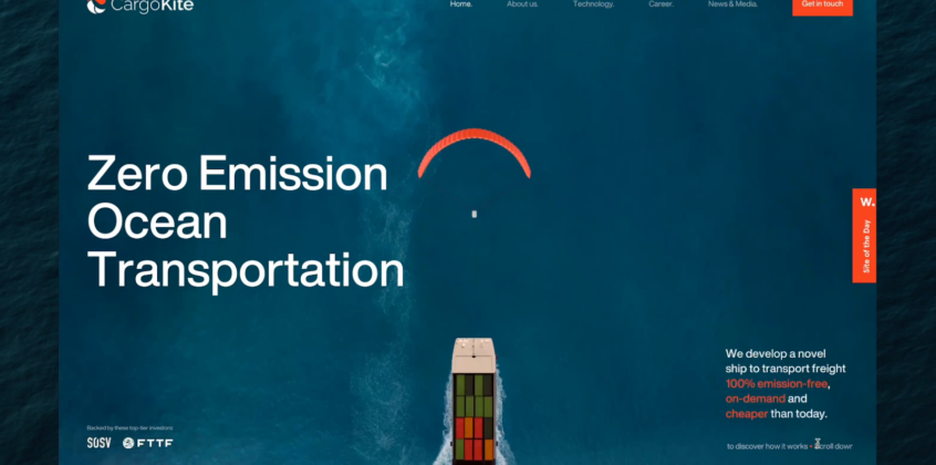
Bearplus transforms a complex maritime concept into a clear, visual story by centering the homepage around interactive 3D ship models. Instead of static explanations, users engage directly with the technology, accelerating understanding and trust.
Subtle animations and microinteractions guide movement without pulling focus away from the product. The experience remains consistent across devices, preserving depth and usability beyond desktop. The result presents CargoKite as an innovative transport solution through clarity, motion, and controlled visual storytelling.
2. Smart Water Bottle Website — Product-Centric Design That Drives Clarity
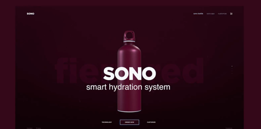
- Agency: Dtail Studio
- Client: Smart Water Bottle
- Industry: Consumer Tech
Dtail Studio places the product at the center of the experience, using clean layouts and a clear visual hierarchy to communicate functionality without overwhelming users. Structured sections, concise messaging, and product-led visuals walk users through features like hydration tracking and smart reminders.
Subtle interactions enhance exploration while keeping attention on the core value. The result is a streamlined, conversion-focused experience that makes a connected product easy to grasp and relevant to everyday use.
3. AI Simulation Platform Landing Page — Making Complex Systems Visually Understandable
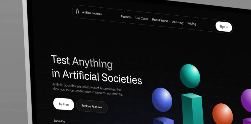
- Agency: Excited
- Client: Artificial Societies
- Industry: AI
Excited’s landing page stands out for turning a complex, technical product into a structured visual system. The dark interface establishes a serious, research-driven tone, while organized layouts break complex ideas into clear, digestible sections.
Abstract 3D elements suggest simulated environments without relying on literal visuals. Typography and spacing guide users through the narrative, preserving clarity despite the subject’s depth. The result presents the platform as both advanced and credible, while keeping it understandable for non-technical decision-makers.
4. Aura – AI Skincare Landing Page Design
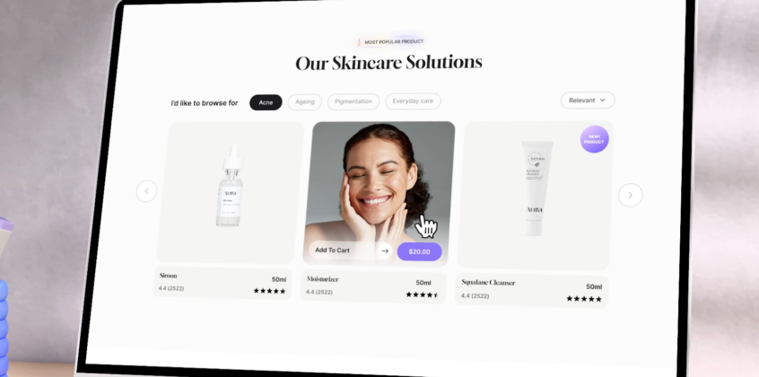
six2eight created a landing page that makes personalized skincare easy to navigate by turning AI-driven recommendations into a guided buying journey. The layout surfaces key decisions like skin type, ingredients, and reviews, helping users move from discovery to purchase with minimal friction.
Soft visuals and a calming palette support the self-care angle, while clean structure keeps usability front and center. By pairing personalization with clear, transparent information, the design positions Aura as a more intuitive alternative to traditional beauty shopping.
5. Noera – AI Coding Assistant SaaS Interface
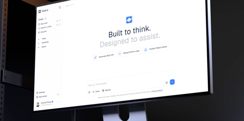
- Agency: Shakuro
- Client: Agency Commissioned
- Industry: SaaS
Shakuro approaches this SaaS interface by embedding AI directly into the developer workflow instead of isolating it as a separate feature set. The experience centers around a continuous workspace where prompts, outputs, and context evolve together, removing the need for fragmented views.
This setup supports uninterrupted work, enabling developers to write, debug, and refine code in one place. A minimal visual layer, clear hierarchy, and lightweight interactions keep distractions low. The result positions Noera as a seamless, workflow-driven assistant built for daily development tasks.
Top 5 Web Development Shots
The following web development shots highlight how complex functionality can be delivered through clean, high-performance interfaces. Each project demonstrates strong technical execution paired with thoughtful structure, ensuring real-time data, automation, and advanced features remain usable and easy to navigate.
For a deeper look and the complete list of standout builds, explore the Web Development Best Shots of the Year.
1. Haulix Dashboard — Real-Time Logistics Without Interface Overload
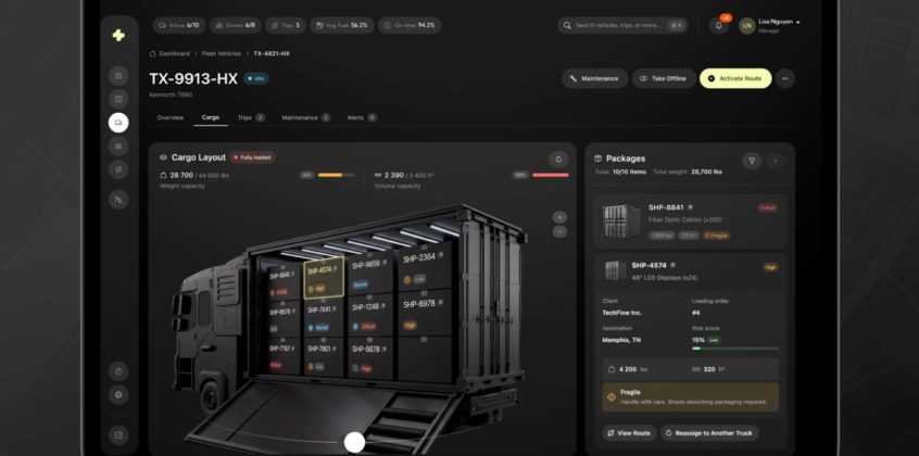
- Agency: Phenomenon Studio
- Client: Haulix
- Industry: Logistics
Phenomenon Studio organizes complex logistics data into a clear, centralized command interface. The dashboard brings together fleet status, trips, and alerts in a single view, removing the need to switch between multiple tools.
Real-time map tracking provides immediate operational context, while dedicated vehicle and driver views surface detailed information without adding clutter. Strong hierarchy and controlled visual density maintain readability under pressure. The result enables fast, informed decisions by turning real-time data into direct operational control.
2. Reelup – AI-Powered Shopify Plugin Landing Page
Dstudio’s landing page stands out by clearly linking AI capabilities to tangible eCommerce results. Rather than relying on abstract messaging, the design demonstrates how video generation and automated campaigns enhance product discovery and drive conversions.
The layout organizes information to guide users from problem to solution without friction. Strong visuals reinforce the shift from static product content to more engaging formats, supporting the product’s value. The result is a focused landing experience that presents AI as a practical tool for driving sales, not just an added feature.
3. Website Design for Industrial Designer Mirko Romanelli
- Agency: Shakuro
- Client: Mirko Romanelli
- Industry: Industrial Design
Shakuro’s work stands out for bringing the logic of physical design into a clean, digital portfolio format. Instead of adding unnecessary visual layers, the design relies on minimal layouts and a neutral palette to keep attention on the projects.
Light motion and consistent spacing help users move through the work smoothly without breaking the viewing rhythm. The layout adapts to different types of industrial design, from detailed product shots to broader concepts. The result is a portfolio that reflects precision and range, while keeping the experience straightforward and content-driven.
4. Insurance Mobile App UI Design
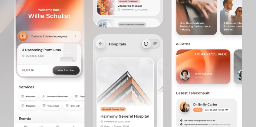
- Agency: Paperpillar
- Client: Agency Commissioned
- Industry: Fintech
Paperpillar’s concept stands out by tackling a common problem in insurance apps: complexity and lack of clarity. The design relies on soft colors, clear typography, and structured spacing to make tasks like policy tracking and claims feel straightforward and manageable.
Rather than dense interfaces, the layout guides users through key actions step by step, reducing friction throughout the experience. The calm visual tone builds trust, which is essential in financial products. The result is an interface that emphasizes usability and confidence over unnecessary features or visual clutter.
5. Elegant – Fashion Brand Landing Page
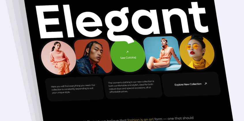
- Agency: Bato
- Client: Elegant
- Industry: eCommerce
Bato’s landing page stands out by focusing on brand expression as the primary driver of the experience. The design uses clean layouts, confident typography, and deliberate spacing to frame products as visual statements rather than just items to browse.
Instead of layering in unnecessary features, the approach leans on minimalism to reinforce a modern, premium identity. The structure supports fast scanning and visual browsing, aligning with how younger audiences engage with fashion. The result is a landing experience that communicates attitude and style first, while keeping interaction straightforward.
Top 5 App Development Shots
These app development shots showcase how code, design, and functionality come together to create seamless, engaging experiences. Each project illustrates how thoughtful flows, responsive interactions, and practical features turn ideas into apps people actually want to use.
For a closer look at more innovative, high-performing projects, explore the App Development Best Shots of the Year.
1. Hence — Website Overview
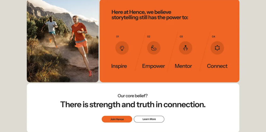
- Agency: Kreativa Studio
- Client: HENCE
- Industry: SaaS
Kreativa Studio partnered with Hence to shape both the platform and its digital presence, building an environment designed to connect brands with the creative minds behind impactful content. The project centers on simplifying how companies discover talent, form partnerships, and move ideas from early concepts to fully produced campaigns.
Through a refined visual language and thoughtfully organized interface, the platform encourages exploration, collaboration, and seamless project coordination. The result is a polished, tech-forward ecosystem where strategists, storytellers, and creators can work together more efficiently—helping brands produce meaningful, high-quality content with far less friction.
2. EasyPay: E-Wallet Digital Payment App
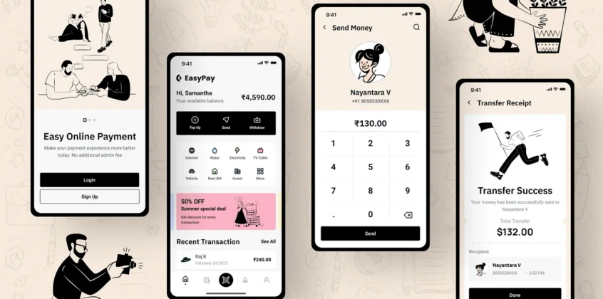
- Agency: Nickelfox
- Client: EasyPay
- Industry: Fintech
Nickelfox designed EasyPay as a mobile-first digital wallet built to simplify how people handle everyday finances. The concept brings money transfers, bill payments, and expense management into one cohesive app, focusing on fast interactions and intuitive navigation that reduce the friction often associated with financial tasks.
A sleek interface balances dark and light visual themes with crisp typography and subtle illustrations, creating a modern fintech feel while keeping core actions easy to reach. The result is a refined payment experience that makes managing, sending, and tracking money feel quick, secure, and effortlessly integrated into daily life.
3. ClaraAI —AI mental health app
- Agency: Lazyinterface
- Client: Agency Commissioned
- Industry: Healthtech
Lazyinterface’s concept for an AI-powered mental health app imagines a supportive digital space where technology and emotional care work together seamlessly. The experience is designed to guide users through self-care tools, daily check-ins, and conversational support with clarity and ease, helping them navigate their well-being without feeling overwhelmed.
Soft color palettes, approachable UI elements, and carefully chosen typography create a calm, reassuring environment that encourages reflection and consistency. The result is a thoughtfully crafted interface that positions the app as a gentle, intelligent companion for everyday mental wellness.
4. Abuk — Audio Book Platform
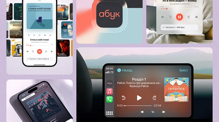
Tubik reimagined Ukraine’s leading audiobook and podcast platform to deliver a more welcoming and intuitive listening experience across iOS, Android, web, and CarPlay. The redesign centers on smoother content discovery and effortless playback, using clearer navigation, curated recommendations, and content-focused layouts that help users quickly find what they want to hear next.
A refreshed visual system built around warmer color palettes, improved typography, and subtle interface layering adds depth without competing with the audio itself. The result is a more polished and immersive platform that encourages exploration while keeping the listening experience smooth and distraction-free.
5. Starvy — AI Marketing Website Hero Section
- Agency: Illiyin Studio
- Client: Starvy
- Industry: SaaS
Illiyin Studio crafts a striking, almost sci-fi introduction for Starvy, an AI-powered marketing platform. The design blends bold, energetic typography with motion-driven visuals, conveying innovation and forward-thinking intelligence at a glance.
Thoughtfully structured layouts and high-contrast elements guide attention naturally, while nuanced effects and refined interface details add dimension without overwhelming. The outcome is a polished, modern hero section that positions Starvy as a sleek, smart solution built to help marketers navigate complex campaigns with confidence and clarity.
Top 5 Product Design Shots
These product design shots show how thoughtful UX and interface decisions turn complex features into intuitive, everyday tools. Each project focuses on usability, clarity, and real user needs, proving that strong product design is driven by how well it works, not just how it looks.
For a full breakdown and more standout examples, explore the Product Design Best Shots of the Year.
1. Lunerise Smart Clock App — Seamless Device Pairing and Night-First UX
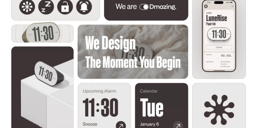
- Agency: Dmazing
- Client: Lunerise
- Industry: IoT
Dmazing’s Lunerise app stands out by treating hardware and software as a unified experience. The pairing flow minimizes friction through clear system feedback and eliminates dead ends, while the home dashboard presents alarms, calendar, and quick actions in a clean, uncluttered way.
A dedicated watch face library introduces personalization without compromising usability, and the sleep playlist is tailored for low-light, nighttime interaction. Motion prototyping connects the experience, ensuring transitions feel deliberate and the product behaves consistently across every touchpoint.
2. Electrys – EV Charging App
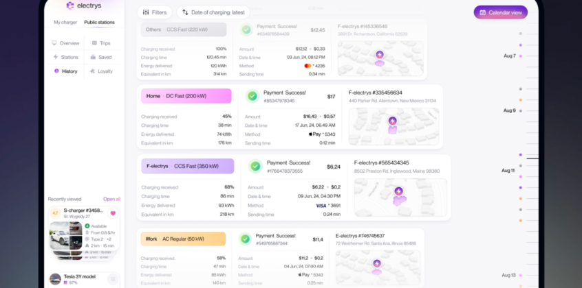
- Agency: Fireart Studio
- Client: Electrys
- Industry: Energy
Fireart Studio designed Electrys to make EV charging simple and predictable. The interface structures key actions: finding stations, checking availability, and starting sessions into clear, step-by-step flows.
Map integration and status indicators provide real-time visibility, reducing uncertainty at a glance. A clean visual style with controlled color usage keeps attention on essential tasks without distraction. The result enables faster, on-the-go decisions and positions Electrys as a dependable tool for everyday EV users who value efficiency and clarity.
3. Pal Affi. – Gaming Platform Landing Page
- Agency: Artspire
- Client: Pal Affiliates
- Industry: Gaming
Artspire creates landing pages that mirror the fast-paced nature of gaming platforms through bold visuals and interactive elements. 3D graphics and animations introduce depth, making the experience more immersive without compromising usability.
The layout leads users through key information: from platform benefits to partner opportunities, in a structured flow. Strong color contrasts and dynamic sections hold attention throughout the scroll. The result positions Pal Affiliates as a modern, high-energy platform built to attract and convert users in a competitive gaming space.
4. Lume – Journaling App
- Agency: Morva Labs
- Client: Lume
- Industry: Healthcare
Morva Labs designed Lume to make journaling feel simple and approachable rather than overwhelming. The interface relies on soft colors and minimal elements to create a calm environment that encourages regular use.
Content is structured into clear sections, allowing users to capture thoughts, track patterns, and revisit entries without friction. The layout stays uncluttered, keeping the focus on writing and reflection. The result presents Lume as a practical tool for building a journaling habit through clarity, comfort, and ease of use.
5. Eventrise — Event Management Platform
Heyo designs Eventrise to give event organizers immediate visibility into performance without relying on complex reports. The dashboard presents key metrics like ticket sales, trends, and revenue in a clear, easy-to-digest layout. Color is applied strategically to separate data points and highlight changes, making it easy to identify what needs attention.
The structure enables quick decision-making by reducing the need for deep analysis. The result positions Eventrise as a practical tool for managing events through real-time insights rather than delayed reporting.
Top 5 UI/UX Design Shots
These UI/UX shots highlight the craft behind interfaces that feel effortless to use. Each example demonstrates how smart interactions, clear hierarchy, and thoughtful layouts transform ideas into experiences that click—literally and intuitively.
For a deeper dive into more innovative and user-focused projects, check out the UI/UX Best Shots of the Year.
1. Digcy — Gamified Crypto App
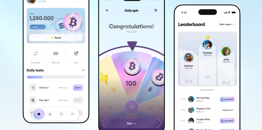
- Agency: Digcy
- Client: Agency Commissioned
- Industry: Fintech
Digcy’s Crypto App concept transforms everyday crypto use into an engaging, game-like experience by highlighting a daily rewards mechanic at the heart of the interface. Vibrant colors and dynamic visuals draw attention to the spin feature, making interaction feel both exciting and effortless.
Structured layouts, striking typography, and interactive touches balance playful elements with core crypto functionality. The result is a modern, engaging app that feels fun without sacrificing purpose, encouraging users to return daily while staying in control of their financial goals.
2. Outloud — Crypto App Design
- Agency: Outloud
- Client: Agency Commissioned
- Industry: Fintech
Outloud’s crypto app concept rethinks trading and wallet management by turning complex data into a clear, approachable experience. Portfolios, market insights, and transaction tools are arranged in modular, easy-to-scan sections that keep essential information front and center.
A bright, high-contrast interface with bold accent colors emphasizes price changes and key actions without creating visual clutter. Thoughtful charts and structured cards make decision-making intuitive, positioning the app as a modern, efficient platform for managing crypto assets with confidence and clarity.
3. Autism Care Centre — SaaS Platform Design
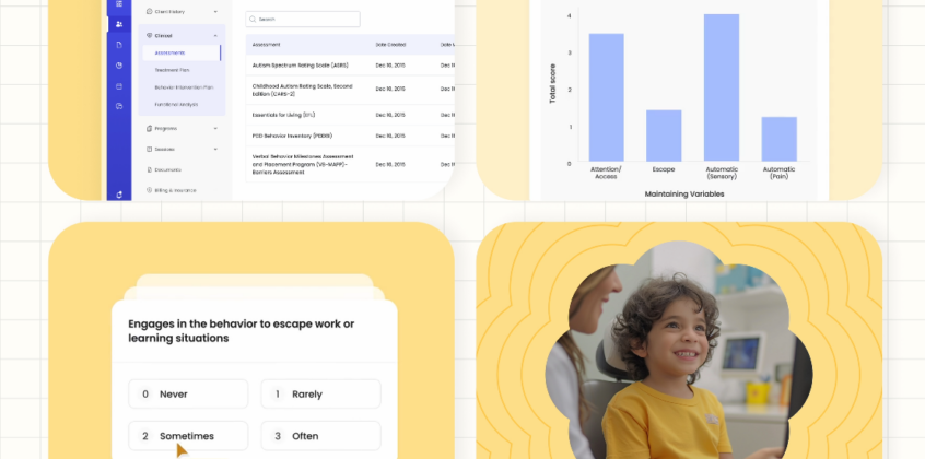
- Agency: Ungrammary
- Client: Agency Commissioned
- Industry: Healthcare
The Autism Care Centre SaaS platform transforms therapy management into a streamlined, intuitive digital workspace for clinicians and caregivers. Built around real-world therapy workflows, the interface enables easy session logging, progress tracking, and care plan management—so professionals can focus more on patients and less on paperwork.
Soft, calming colors, clean layouts, and straightforward navigation minimize cognitive load, while customizable dashboards and efficient interactions deliver a user-centered experience designed specifically for autism therapy settings.
4. Cerebra – Cyber Security Platform
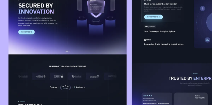
Wavespace crafted the Cerebra cybersecurity landing page to make complex enterprise security easy to grasp. Clear hero sections and modular content highlight identity management, integrations, and scalability.
A dark, layered visual style with precise typography and dashboard previews conveys trust while maintaining readability. The design simplifies advanced cybersecurity concepts, guiding users through the platform’s capabilities and positioning Cerebra as a modern, robust solution for enterprise security.
5. Roobinium — Web3 | Game | Fintech | AI & Crypto Design Production
- Agency: Roobinium
- Client: Agency Commissioned
- Industry: Marketing
Roobinium’s Web3, fintech, and AI crypto concept merges cutting-edge digital worlds into one intuitive platform. Interactive panels and organized layouts guide users smoothly without overwhelming them.
Bold typography, clear structure, and striking visual accents reinforce a futuristic yet approachable feel. The design balances clarity with high‑tech appeal, positioning the project as a seamless digital hub where gaming, finance, and AI converge into a cohesive, engaging user experience.
The Ultimate 2026 Dribbble Select Best Shots of the Year: Final Thoughts
The projects featured here show how different disciplines approach the same challenge: making complex ideas clear, usable, and relevant. From branding systems to product interfaces, each selection reflects deliberate decisions around structure, interaction, and communication.
Across categories, the strongest work avoids excess and focuses on execution that supports real use cases, not just visual appeal. These projects stand out because they balance clarity, function, and identity in a way that holds up beyond the initial impression.
If you’re looking to achieve similar results, you can submit a Project Brief, and we’ll InstantMatch you with agencies that align with your goals, budget, and timeline, helping you move from inspiration to execution.